Home.ly - A Real estate web app
Home.ly is a real estate web app that helps people find their perfect home.
Home.ly is a real estate web app that helps people find their perfect home.

As a student at CareerFoundry, I was tasked to create a responsive web application for a UI for UX Design Course. This app provides potential homebuyers with information on properties of interest. Its target audience is first-time, small-scale property buyers who want to find a property to invest in. Buyers can use this tool at home or on the go as long as they are logged in on a device.
This is a responsive web app but also a mobile-first design.
Project for Career Foundry UI Specialization
Sole UI Designer
July - August 2022
Figma | Usability Hub | Google Meet
One of our fundamental goals was to learn what factors first-time homebuyers consider significant while searching for a new home. As the first step, I analyzed some of the existing competitor applications such as Zillow, Redfin, and Realtor.com, as well as communicated with some of their users to know if they face any problems. The summary is what I found below:

Users unable to find suitable homes that meet all of their requirements

Poor UI of slapdash aesthetics

Being bombarded all day every day with photoshopped images

Unable to determine whether a place is safe to live without anxiety or stress
Home.ly is designed for busy, on-the-go professionals. Its features are:
Strong Filtering and Saved Searches
Easy to understand user interface
Compare properties side by side for faster decision making
Being able to contact the homeowner directly and schedule a viewing
Trusted and certified platform for home buying and selling
Home.ly is for small-scale property buyers who are busy professionals with limited experience buying real estate. Jessica John and Vijay Kumar are the representation of the typical users of this app.
I made 2 distinct proto-persona based on a hypothesis about the typical user, if I were to make a user persona I would do interviews with the target to validate it.


Now that I understood Jessica John and Vijay Kumar as primary users, I started sketching out user flows based on the user stories that were provided in the Project brief.
Flow 1: Save and Revisit Properties
“As a user, I want to be able to save or mark properties I am interested in so that I can easily revisit them.” - Jessica John
Flow 2: Schedule a Viewing
"As a user, I want to be able to contact the right people if I am interested in viewing a property, so that I can schedule a viewing" - Vijay Kumar
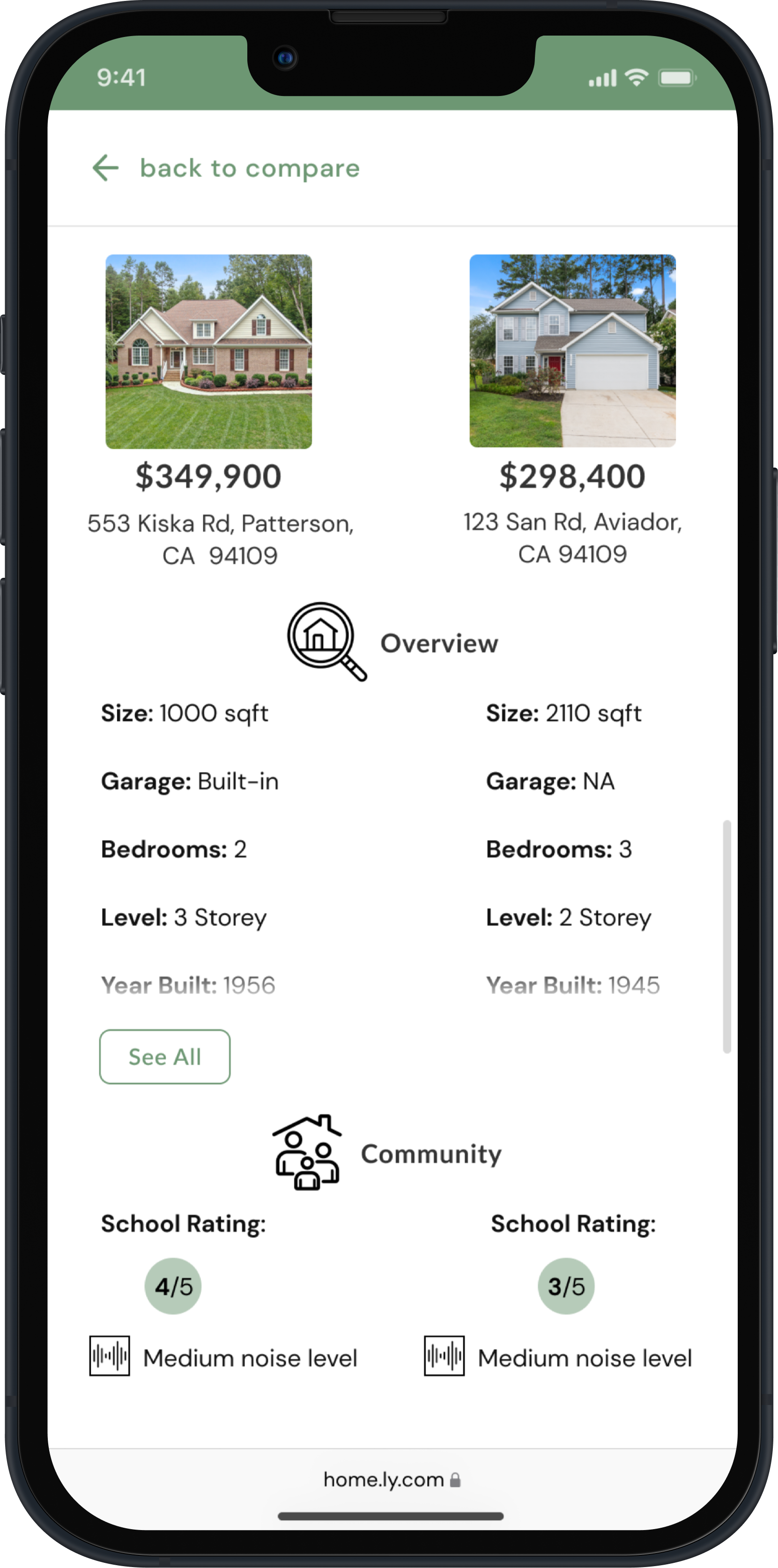
Flow 3: Compare Properties
"As a user, I want to see how well a property meets my criteria or compares to other properties so that I can refine my options."- Jessica John

I sketched out low fidelity wireframes with pen and paper for the above-mentioned user flows. I then translated them to digital format using Figma which shows the information element that will be present on the main pages of the app.


I created 2 mood boards with variations of brown and green as a dominant color.
Though the first one speaks more to my personal color palette, I chose to go with the second mood board - Green because I felt Green gives the feeling of freshness & calm and exudes a peaceful and supportive environment which is exactly what my users need while looking for new homes.


Now that I had a general idea of the mood of the Home.ly app, I refined the typographical hierarchy and color palette. Furthermore, I designed a set of icons with soft shapes and rounded corners to complement the “Home.ly” app.


Home.ly app experience is designed to be easy to use, inviting, and inspiring from the very beginning. Users can easily sign in or create an account in only a few steps.
View detailed property information including photos, address, specifications, and detailed description
Save and easily revisit listings you’re interested in by clicking the ‘heart’ icon in the upper right corner
Switch between List View & Map View
Advanced search options like Filtering and Sorting


Users can ask property agent questions & make appointments for viewing
They can schedule a virtual or in-person tour of the house
Find all the past messages from the chat inbox
Compare up to 3 properties to determine whether the property meets your criteria
Hide the compare tab while browsing


Now that I have all the mobile mockups, the very last step of this project was adapting the design so that “Home.ly” looks beautiful on any device. I chose 834 px and 1512 px for tablet and desktop breakpoints in order to align with the bootstrap breakpoint table specifications. After adding colors and imagery to my tablet and desktop wireframes, I made sure the UI remains consistent across devices.


What went well :)
What could be improved on?
If I had more time?
Although it took time and lots of iteration, I used the most appropriate UI patterns and that’s what made the design intuitive.
The areas that I need to work on are Spacing and Consistency. I believe, more attention to detail will certainly improve consistency across my designs. In terms of Spacing, I think I should spend less time manually spacing and adopt a systematic way of doing it.
Home.ly is intended to be a responsive website, and I have designed a high-fidelity Home Page wireframe for a desktop. I’d like to develop it further and mockup the remaining desktop screens, as well as make a Tablet version of the app.
I will add the needed micro-interactions in the app. I think it will create a memorable experience but further helps to make home-buying less stressful.

